Desmos: Now With More Automatic Feedback

I’m convinced the best choice we made when we started making digital
activities was assuming a human would provide some feedback on student
work. When technologists assume that
a computer will provide all the feedback, they constrain their
activities to the limitations of computers rather than their highest
aspirations for student learning.
For example, we knew we wanted students to argue mathematically with written responses. We knew we wanted students to model graphically with hand-drawn sketches. We knew we wanted students to represent their opinions mathematically with graphs and equations and numbers.
Written responses, sketches, and opinions are either challenging or impossible for computers to assess in 2017, which is why you don’t find them in a lot of digital math activities.
Up until now, we have only offered automatic feedback on a very small handful of item types – multiple choice, for instance – and then passed the remainder of student work on to the teacher as a resource for class and individual conversations.
We’re certain that was the right place to start. Over the last several months, however, we’ve asked ourselves what we can do to offer teachers more automatic insight into student thinking without sacrificing what we love about our activities.
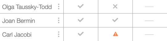
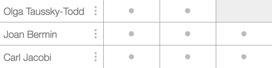
So we now display one of these five icons on each screen:
-
Dash: It isn’t possible for students to do any work on this
screen. Save your time and attention for other screens.
- Check: Everything on this screen is correct.
- Cross: Something on this screen is incorrect.
-
Warning: Something on this screen isn’t merely incorrect but it
indicates the student may have misunderstood the question itself – intervene
ASAP.
- Dot: This screen needs human interpretation.
A few notes about this process:
-
Lots of student work still falls into that final category. The most
interesting mathematical thinking is still very hard for a computer to
assess. All we can do is shrug and hand it off to much smarter humans.
-
We are very conservative in our application of correct checks and incorrect
crosses. For example, on our multiple choice + explanation items, we will
never display a check because we have no way of knowing if the explanation
is correct.
- We had to write unique code to display these icons. That meant that across our hundreds of activities and thousands of interactions between students and math, a Desmos faculty member devised a unique definition of “correctness.” Then she applied it, and two other faculty members reviewed it, asking themselves, “Can we really be so certain here? Is this diminishing student thinking at all?”
We can now offer teachers automatic feedback on all kinds of rich mathematical experiences. For one example, we can ask students to create a sinusoid for their partner. Any sinusoid:
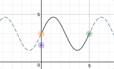
The partner then graphs it algebraically.
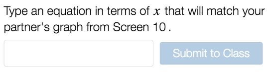
And we’ll give the teacher automatic feedback, no matter what sinusoid the students originally created!
We realize that a teacher’s time and attention are finite and precious.
We hope that the addition of these icons to our activities will help teachers
spend them wisely.