
Welcome to a series of posts sharing how we #Desmosify the curriculum from Open Up Resources/Illustrative Mathematics. You can use this lesson for free, experience it in a live show next week, or sign up to get many more activities just like it in our core middle school curriculum!
Here’s how we #Desmosified an Open Up Resources/IM lesson about fitting lines to data.
Desmosification #1: Collect and connect student creativity.
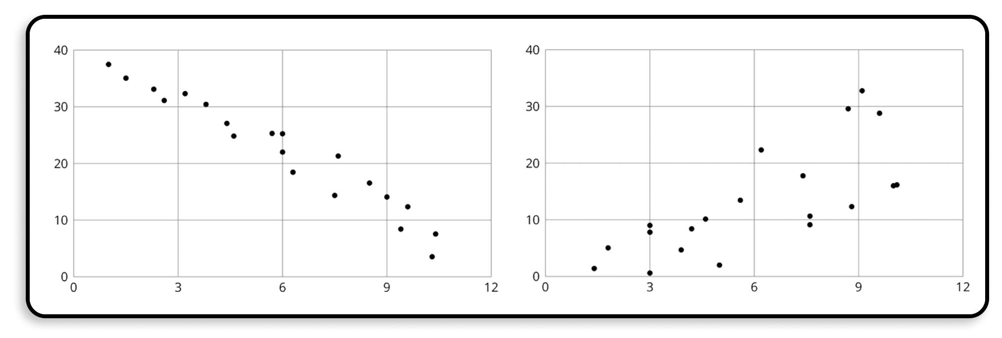
In the original lesson, students draw a line based on data that are tightly correlated and then loosely correlated. Ideally, they’d notice how the spread of the data makes fitting a line easier and harder.
“Compare [your lines] with a partner’s,” asks the lesson, a question which under really good conditions will result in useful learning. But what if your partner hasn’t drawn a line yet? What if you and your partner have a very similar or very different line? What if you’re learning virtually during a pandemic?!
On Desmos, we ask students to draw the two lines and then … we collect and connect all of them.
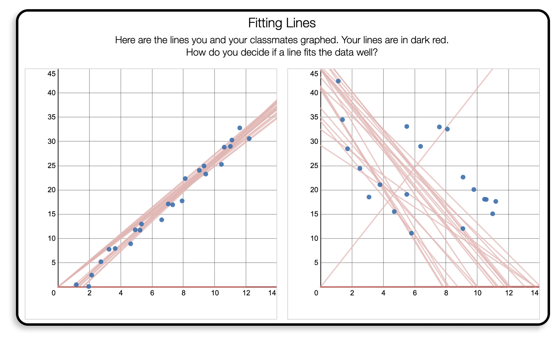
That’s both of your lines, along with all the lines from your classmates, all on the same screen!
It’s an image that helps students make the connection between the spread of the data and the fit of the line with incredible efficiency.
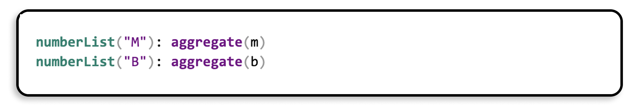
This is the Computation Layer code that powers this screen!
Desmosification #2: Give students interpretive feedback.
The original lesson then asks students to compare two lines that are fit to the same data and think about which one is a better fit. The lesson asks questions about how many points are above and below the line and how many points are less than a certain distance away from the line.
The lesson tries to help students develop an intuition for fitting lines to data, but paper limits the kinds of experiences students can have here.
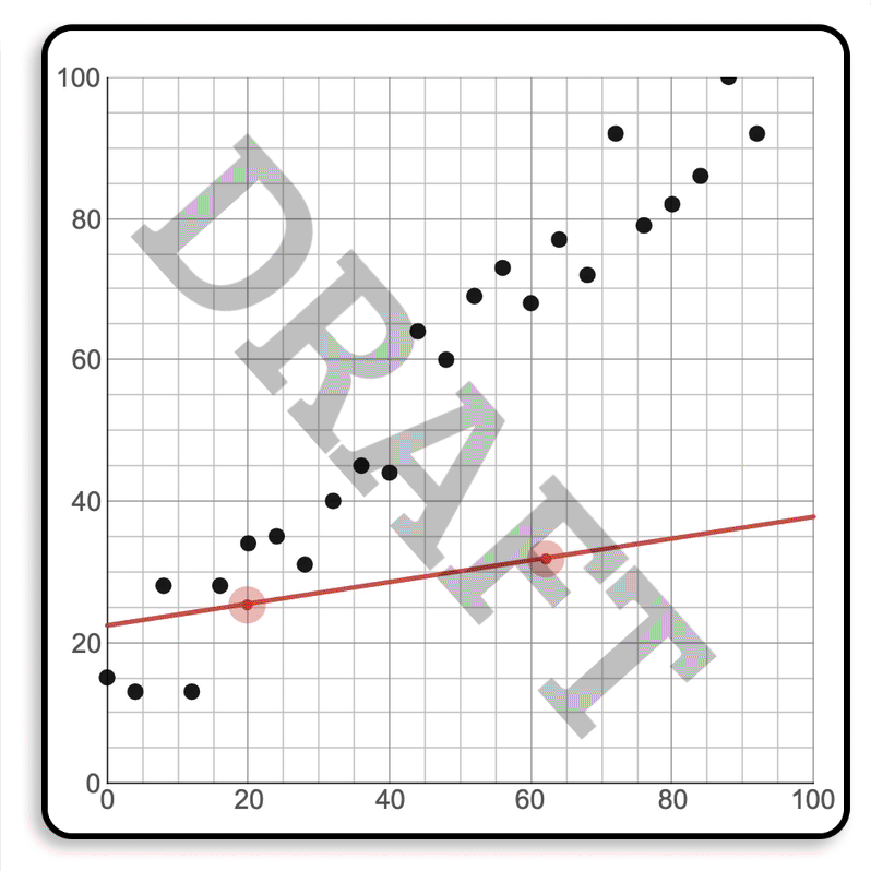
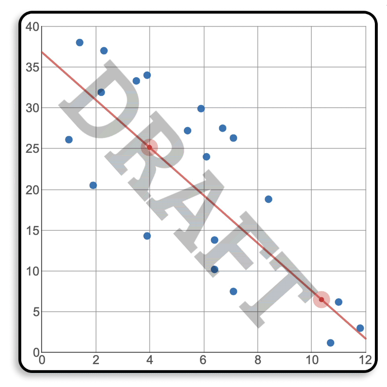
Using digital technology, we ask students to draw a line to fit the data, and then we interpret their line with a meter that gives them feedback on their fit.
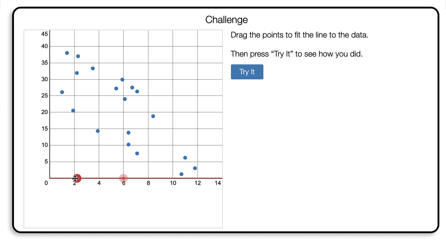
We’ll even let you know if you have the closest fit in your class!
Desmosification #3: Collect and connect student creativity.
Let’s run this #Desmosification again! In the paper lesson, the authors ask students to practice fitting lines to several prefabricated sets of data.
This felt like a useful opportunity for us to invite students to create their own data sets and practice fitting lines to data from their classmates.
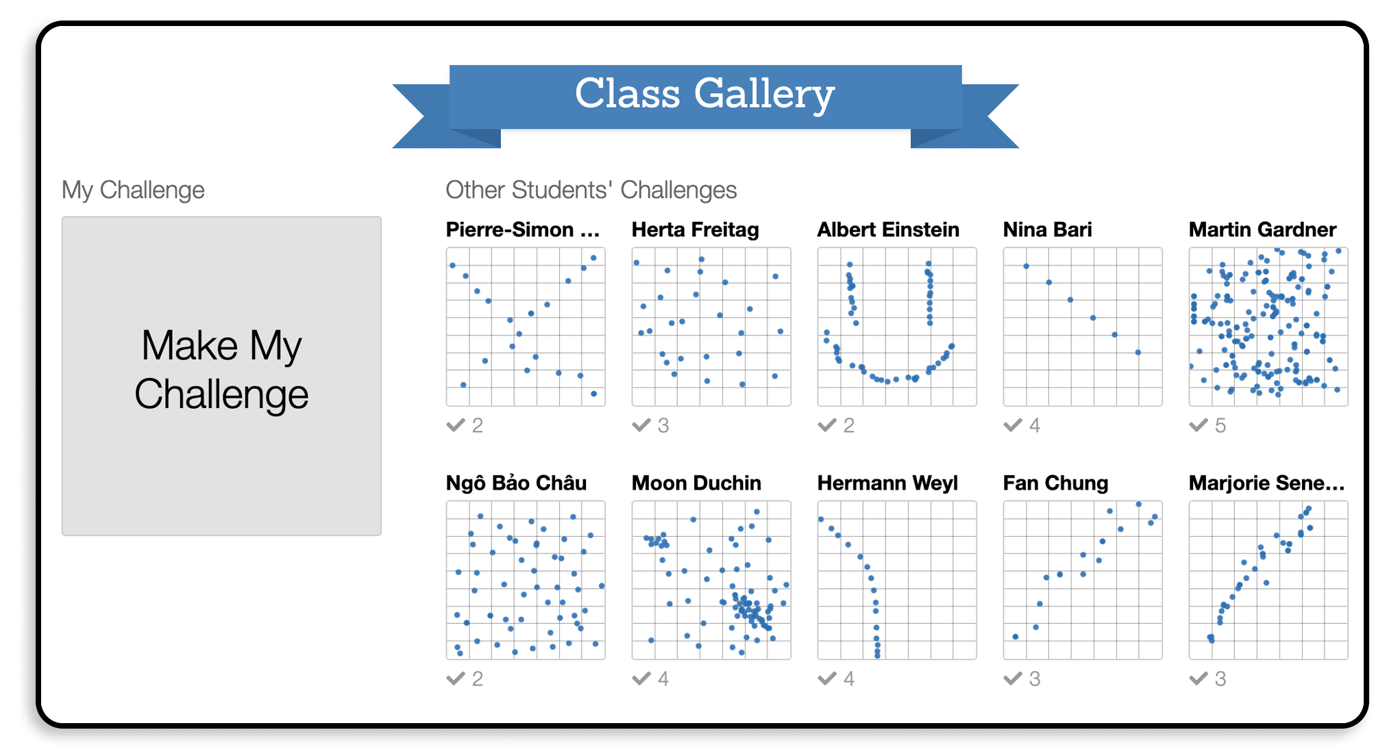
We required a minimum of five data points and students went way above and beyond. They’re getting more than practice fitting lines here; they’re getting the realization that they are authors of math and math problems just as much as the grown-up authors of their curriculum are.
Check Out Our Brilliant Community
We asked our community how they would #Desmosify this kind of math and they did not disappoint.
Give a graph of the data and ask students to draw a line that best predicts the data. Then do a class overlay of everyone’s lines… and that’s where I get stuck!
Create y=mx+b lines with sliders to move around to make a best estimate, overlay all the students’ responses (or show in summary) to find agreements and disagreements. Have a discussion about those. Refine and repeat until everyone is mostly in agreement!
A cool exploration could be to make a line with moveable points and show the “score” (SSR). Tell them it’s like golf – lowest score wins. Then let them play and ask what makes a line a good one. Bonus: have them hit a submit button before seeing the score, Marbleslides-style.
Behind the Scenes
A word from Desmos lesson developer Lisa Bejarano on the development of that meter:
I had the hardest time deciding how to provide feedback on the accuracy of a line of fit. I knew I wanted students to get interpretive feedback so that they knew: 1) How to improve their line of it and 2) why the new line had an improved fit.
In an early draft, we provided a numerical score for the accuracy of the line of fit, but it was not clear what the score meant or how it was calculated.
I wanted a way for students to see how accurate their line was while keeping this interaction focused on the line of fit and not on measures of variance that are not appropriate at this grade level.
The next idea was to draw a blob around the line and count how many points were inside the blob so that it was more obvious to students how they could improve their line, but that is not a very precise method for measuring the accuracy of a line of fit.
A third idea was to draw in the actual line of best fit and compare it to the student’s line, but that provides an answer, which would eliminate the opportunity for students to iterate on their own thinking.
Then we had the idea to add the meter instead of a numerical score. We decided to include the residuals as a visual indication of how students can adjust their line to improve their score.
What Did Teachers Think?
The “good line of fit - o - meter” for creating the line of fit was spectacular! SO POWERFUL!
The students were really able to see what is a good fit for the data with the meters.
I would change nothing about this lesson. I loved this lesson so much and that meter was so awesome for the kids! They love it when they get that okay on their own screen!
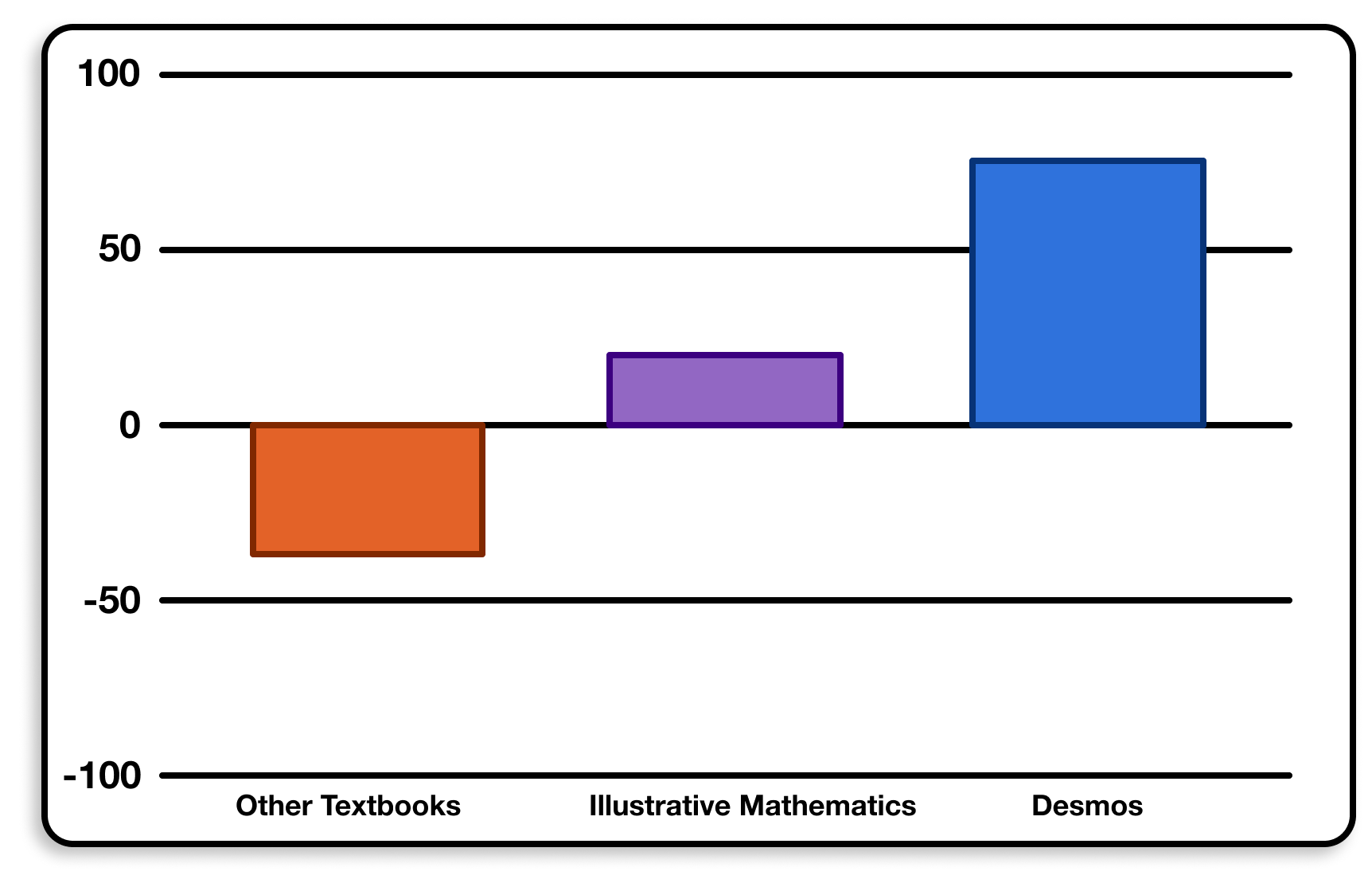
Overall, teachers in our 2019-20 pilot study really liked the Open Up Resources/Illustrative Mathematics curriculum … but they loved what we did to #Desmosify it. (Definition of the scale.)
What’s Next?
- Invite your students to play with Fit Fights!
- Get activities like this every day in our core middle school math curriculum.
- Join me on Monday, Sept. 21 at 4 p.m. Pacific for #DesmosLive where we’ll discuss this activity and other exciting examples of Desmos technology.