
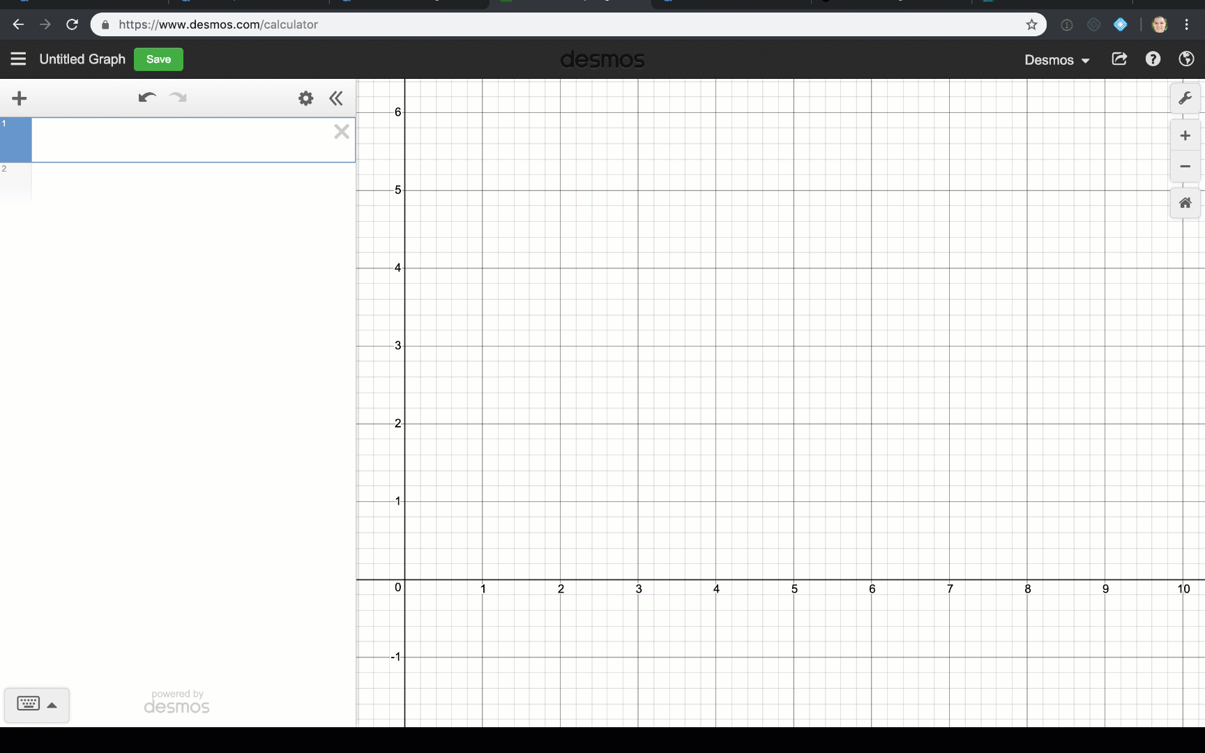
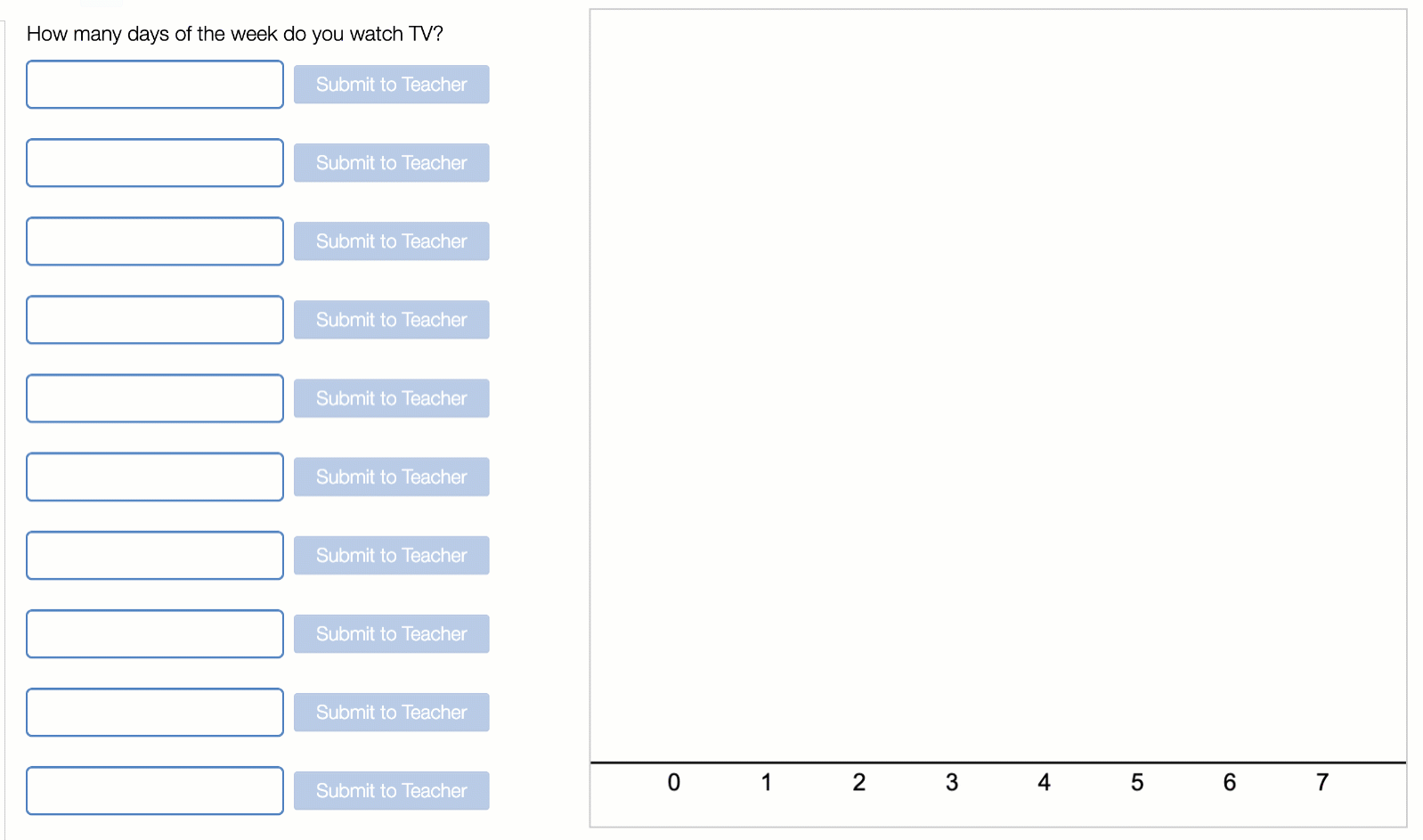
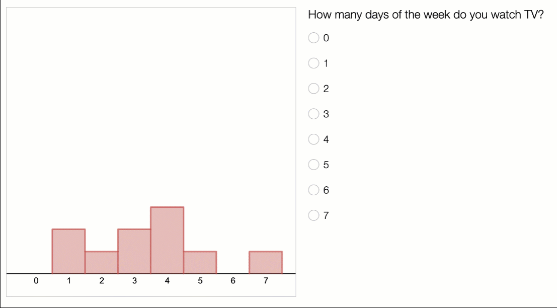
Let’s say you want to poll your students on the number of days they spend each week watching television. Now, let’s assume that you want to do something meaningful with that information. A dot plot should do the trick. Luckily, Desmos has already answered that prayer and you can go desmos.com/calculator to quickly make a beautiful, pristine dot plot in seconds. Organize your data into a list and tell the calculator you want to make a dotplot.
Now the tough part, how do you get all this class data collected into a graph that each student can work with? Here are your options:
- Have students write their answers on a piece of paper or a board. Copy the numbers down one by one.
- Call on students one at a time and record the information on your computer. Share a link to the graph where you’ve collected it.
- Allow students to come up to your computer and record the information themselves. Again, share a link.
Does none of these options sound great to you? We now have a better way.
(Note: in order to continue, you need to turn on computation layer for your Desmos account if you haven’t already. Go to teacher.desmos.com/labs to do that and to learn more.)
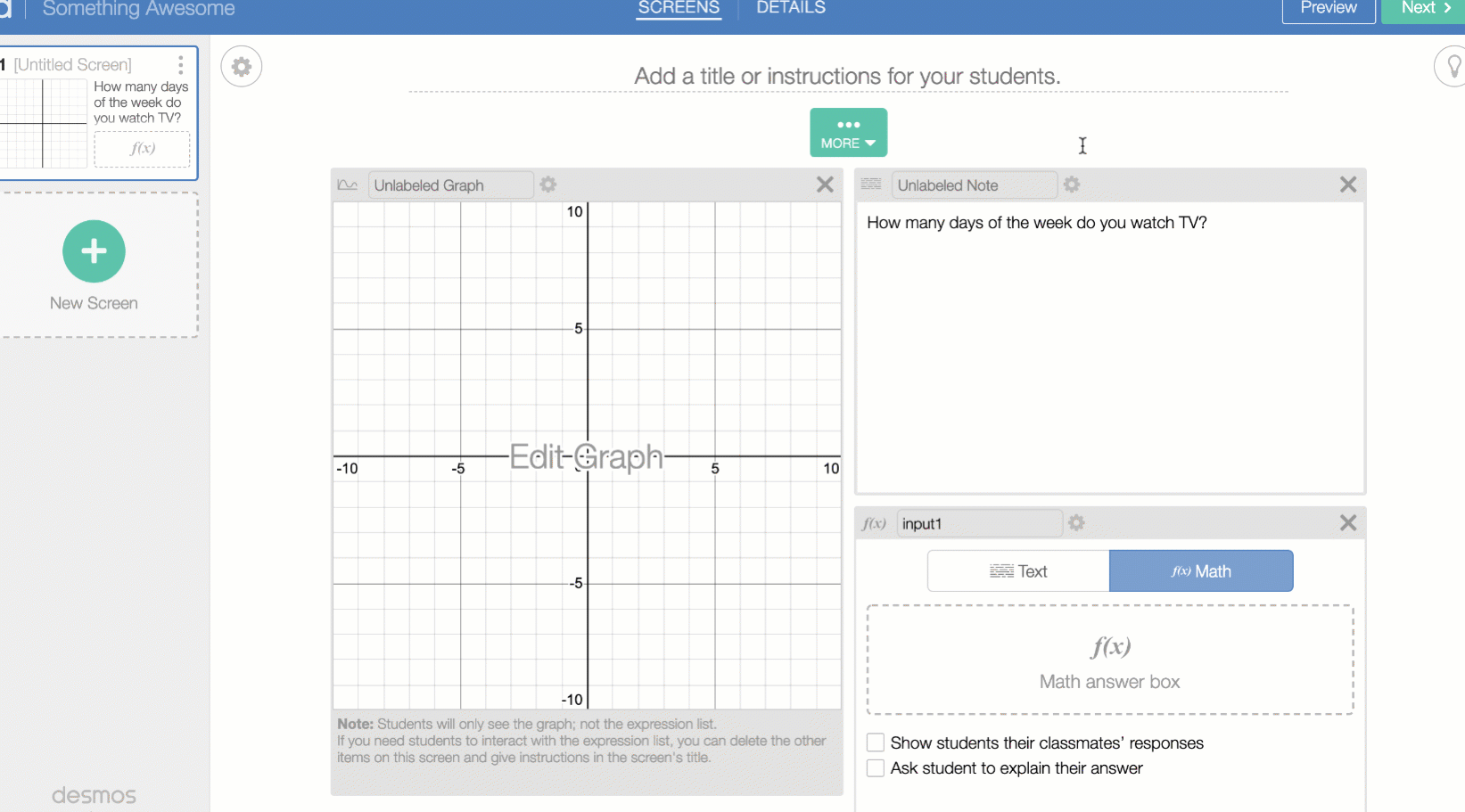
Go to teacher.desmos.com and start a new activity. Give an awesome title, then add a graph to the first screen. Add a note and a math input. Give your students some instructions in the note and name your math input.
![Animation showing the process described above]](/articles/friday-fave-for-february-22/process1.gif)
Adjust the window settings for your graph to fit the data you’ll collect and make a sample dot plot in the graph. Be sure to use a named list (and remember the name). Make up fake data—don’t worry we’ll replace it with real stuff later.
Now the fun part.
Open the script in your graph. You’re going to use the aggregate function to collect all of the student data in the class. We want to collect all of the numeric values from each student’s input, so let’s tell the function to do that by typing it into the parentheses. Lastly, we need to make this into a numberList. Hopefully you remember the name you gave it, create your numberList out of your aggregated values.
You’re finished! Run a class with some fake students to double check your work.
Want to get creative? Don’t limit yourself to using a math input and a dot plot, use a multiple choice input and a histogram… or enter date with a draggable point!
Each of these techniques is demonstrated in this sample activity, which you can copy and edit in order to see the inner workings.
The aggregate function doesn’t just work with the statistics tools, it can be used to take any numeric value from a student’s computer and compile it into a list with other student data. Where you pull that number from and what you use it for is up to you!