
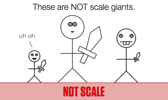
In Marcellus the Giant, students learn what it means for one image to be a “scale” replica of another. They learn how to use scale to solve for missing dimensions in a proportional relationship. They also learn how scale relationships are represented in a graph.
There are three reasons we wanted to bring this activity to your attention today.
First
Marcellus the Giant is the kind of activity that would have taken us months to build a year ago. Our new Computation Layer let Eli Luberoff and Dan Meyer build it in a couple of weeks. We’re learning how to make better activities faster!
Second
When we offer students explicit instruction, our building code recommends: “Keep expository screens short, focused, and connected to existing student thinking.”
It’s hard for print curricula to connect to existing student thinking. Those pages may have been printed miles away from the student’s thinking and years earlier. They’re static.
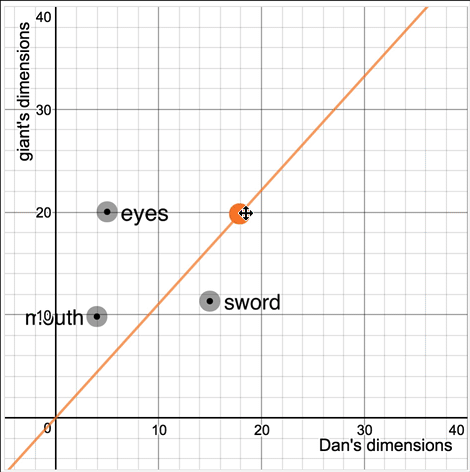
In our case, we ask students to pick their own scale factor.
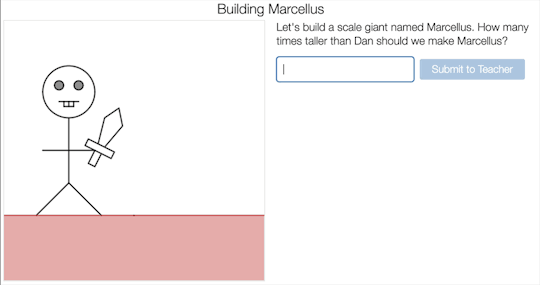
Then we ask them to click and drag and try to create a scale giant on intuition alone. (“Ask for informal analysis before formal analysis.”)
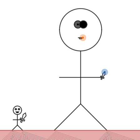
Then we teach students about proportional relationships by referring to the difference between their scale factor and the giant they created.
You made Marcellus 3.4 times as tall as Dan but you dragged Marcellus’s mouth to be 6 times wider than Dan’s mouth. A proportional giant would have the same multiple for both.
Our hypothesis is that students will find this instruction more educational and interesting than the kind of instruction that starts explaining without any kind of reference to what the student has done or already knows.
That’s possible in a digital environment like our Activity Builder. I don’t know how we’d do this on paper.
Third
Marcellus the Giant allows us to connect math back to the world in a way that print curricula can’t.
Typically, math textbooks offers students some glimpse of the world – two trains traveling towards each other, for example – and then asks them to represent that world mathematically. The curriculum asks students to turn that mathematical representation into other mathematical representations – for instance a table into a graph, or a graph into an equation – but it rarely lets students turn that math back into the world.
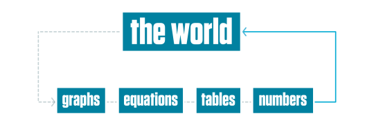
If students change their equation, the world doesn’t then change to match. If the student changes the slope of the graph, the world doesn’t change with it. It’s really, really difficult for print curriculum to offer that kind of dynamic representation.
But we can. When students change the graph, we change their giant.
There is lots of evidence that connecting representations helps students understand the representations themselves. Everyone tries to connect the mathematical representations to each other. Desmos is trying to connect those representations back to the world.