
Check it out! We’ve made changes to your activity dashboards.
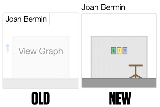
Before:
After:

We don’t make these kinds of changes lightly. We want our software and your classes to become tightly integrated, and a change of this magnitude isn’t far from coming to class and finding your furniture re-arranged. We want to explain why we re-arranged your furniture.
First, we don’t make these decisions in a vacuum. In the five years since we debuted our first activity dashboard, we’ve logged tens of thousands of support emails, thousands of feature requests over Twitter, and hundreds of hours of classroom testing, all of which gave us a very clear set of goals heading into the project.
Here are those goals, and how we tried to accomplish them.
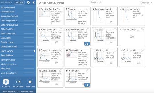
Our activities have grown richer and more complex, and our dashboard needed to keep up.
We create activities internally using a scripting language we call Computation Layer, which enables very interesting interactions between students and mathematics. Our previous dashboard required you to click through to individual student screens to learn anything about those interactions. We wanted to make sure our new dashboard gave teachers a transparent view into student work.
We wanted to make sure teachers could see the class’s progress at a glance.
Previously, teachers had to look at one student screen after another in order to get a sense of the class’s progress. We heard from lots of teachers and we also experienced ourselves the need for a summary view.
We’re starting as simply as we can here. We could add lots of icons to these cells. We could surface the equation each student graphed, or their solution for a problem. But we decided this view should show as little it had to in order to help teachers do their work. We started with a blank summary view and made each icon we added clearly articulate its value to the teacher and fight for its place.
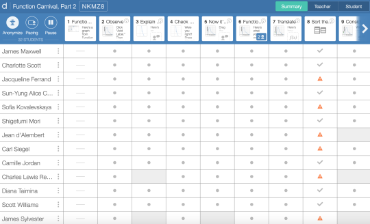
We needed to simplify our conversation toolkit – especially teacher pacing.
One way we separate ourselves from a lot of math edtech is that we design activities for classrooms, not individuals. Our ideal Desmos Classroom is a social, chatty space, where the teacher is using our dashboard to orchestrate productive discussions and arbitrate mathematical arguments.
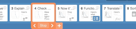
That’s why we built our conversation toolset, not for classroom management, but for classroom dialog. That toolkit includes the ability to pace students to one or more screens, so that your class can mine those parts of our activities for all the value they offer before moving on.
That pacing is central to the value we offer teachers and students, but our classroom testing demonstrated time and again that it wasn’t as intuitive as it needed to be.
So we changed our pacing interface, adding a ribbon of thumbnails across the top of the screen so you can always see where the class is and where it’s going. We made it easy to advance every student a slide ahead and to change the boundaries on their exploration.
Early Feedback
Each of our teams at Desmos bring unique value to our work. The teaching team represented the needs of teachers, especially their need not to waste a single second trying to interpret a confusing user interface. The product team made those designs and our engineering team rigged it all up to work.
The early feedback has been extremely positive:
Summary view is brilliant, also the new pacing interface is much better – easy to set up pacing and also change the set of screens without removing pacing altogether.
I like that you can focus on one student’s work or one question’s answers. Much easier to give feedback.
It seemed easier to switch between different student answers when talking through some key misunderstandings with the whole class.
There isn’t a better time to try out a free Desmos activity. We’re so grateful to everyone who offered feedback that helped us develop this tool and we’d love to hear from more of you on Twitter @desmos or by email to feedback@desmos.com.