Friday Fave for June 23

The Friday Fave enjoyed a splendid Zero Derivative of Day Length Day this
week, and hopes that you did too. In the Fave’s part of the world, the
days are now getting shorter. Maybe in yours they’re getting longer.
Either way, we all have Zero Derivative Day in common.
That got the Friday Fave thinking about daylight relationships more broadly, which leads the Fave to remind you of the activity Burning Daylight—this week’s Friday Fave.
If you are a math teacher with any affinity for applications or modeling at all (and that should be pretty close to everybody reading this right now), you probably see many beautiful things to notice in the following image, which compares Miami, Florida and Fairbanks, Alaska. Which is which?
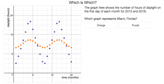
In Burning Daylight, this task launches students into the real question, which is “Which city gets more total daylight?” Calculus is a useful tool for answering that question, but not an essential one.
Students model with trig functions; they develop their own ways of answering that big question, and then we ask a terrific question to get them thinking more deeply about the connections between the math and the reality.
Barrow, Alaska is the northernmost city in the United States. What does the graph of daylight hours look like for Barrow?
While you’re thinking about trig functions, here are a few other opportunities to play with sines, cosines, and all the rest: