The Desmos Geometry Tool

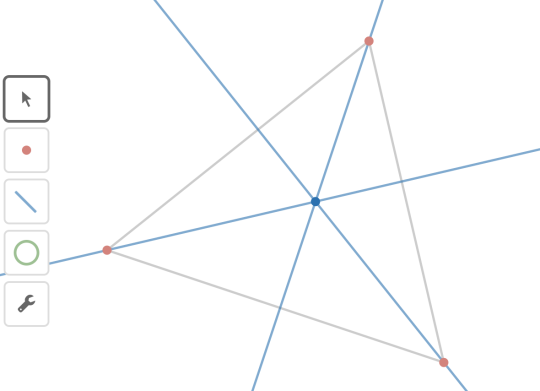
Desmos is proud to announce the beta release of our geometry tool. You can
find it at
www.desmos.com/geometry, with
support materials at
learn.desmos.com/geometry.
“Beta” means this product will continue to change in ways small and large. “Beta” means we’re in the process of creating helpful documentation, tutorials, and examples. “Beta” means we don’t warranty this product for your classrooms or presentations just yet, and if you use it in those contexts you should offer lots of assistance along with all of these disclaimers.
“Beta” also means we want your feedback. (Send email to feedback@desmos.com or tweets to @desmos.) What features do you want? Do you see sharp edges that need sanding? Tell us what you like and, more importantly, what confuses or surprises you. Your feedback makes us and our products stronger.
Our goal is to release our geometry tool without the “beta” label sometime over the summer, right in time for the start of the 2017-2018 school year in North America. Even at this early stage, we wanted to let our users know why we’re building this product, and how we envision its integration with the rest of our toolset.
Why did we build geometry?
We grew up as students of interactive geometry software. Pioneers like Geometer’s Sketchpad and Cabri laid the groundwork for an entire industry. Other tools, like Geogebra and Euclidea.xyz, have since emerged with their own unique perspectives, strengths, and weaknesses.
Given this wealth of great existing technology, why did we choose to build our own?
First, our goals are different than those embodied by most of those other tools. When we design products, we design first for students who struggle with math and we assume they may also struggle with technology. We strive for a student’s first creation with our tools to feel effortless and joyful. For that reason, our geometry tool has a far shorter list of features than some of those above. We will carefully expand that list over time, never trading power for ease-of-use.
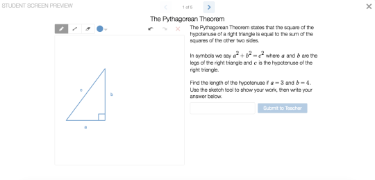
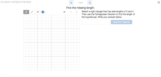
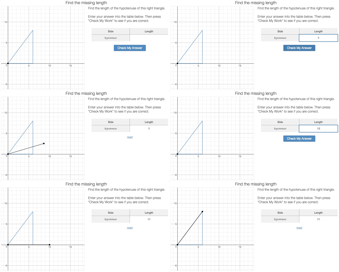
Second, we wanted a geometry tool that integrates cleanly with the rest of our products. We wanted a lightweight, blazingly fast, browser-based tool. We wanted a Geometry API for partners that closely resembles our Graphing API. We wanted a tool that could fit neatly inside of our Activity Builder.
We don’t intend our work in geometry to replace the existing set of interactive geometry tools, but rather to supplement them. We hope our work will open up the magic of synthetic geometry to millions of new students.
Will geometry be free?
Yes. Our geometry product will be completely free, now and for as long as we support it.
We can’t promise that Desmos will always exist (though we promise to try!) nor can we promise that we will always support any given product. (As a small organization, focus is critical and we can only support products that we believe have the biggest impact.) Our promise, instead, is to never move any of our free products behind a “paywall.” We won’t ever charge you for products that are free today.
We can sustain that promise because we’ve partnered with organizations who license our products for commercial use. Those organizations – dozens of them, both large and small – get access to our APIs, which makes it possible to integrate our technology into their programs. They also get access to the knowledge and experience of our team. Partnerships fund our growing business and allow us to keep our products free for teachers and students.
You’ll soon see our geometry tool in products from organizations like Pearson, College Preparatory Mathematics, and Kendall Hunt. If you see one of those products, give it a good, critical evaluation. We only work with ambitious partners who care deeply about teachers, students, math, and technology. And if that sounds like your organization, please email an introduction to partnerships@desmos.com.


